
Redesigning Zowena: Designing with Care
Zowena is a skincare brand with a strong belief in the power of nature. Using botanicals sourced from the heart of South Africa, Zowena combines nature’s goodness with scientifically-proven formulas to create effective, affordable skincare. The redesign of the Zowena website aims to reflect these values while providing a more engaging, streamlined, and accessible experience for users, particularly those who are seeking skincare solutions for stretch marks during pregnancy.
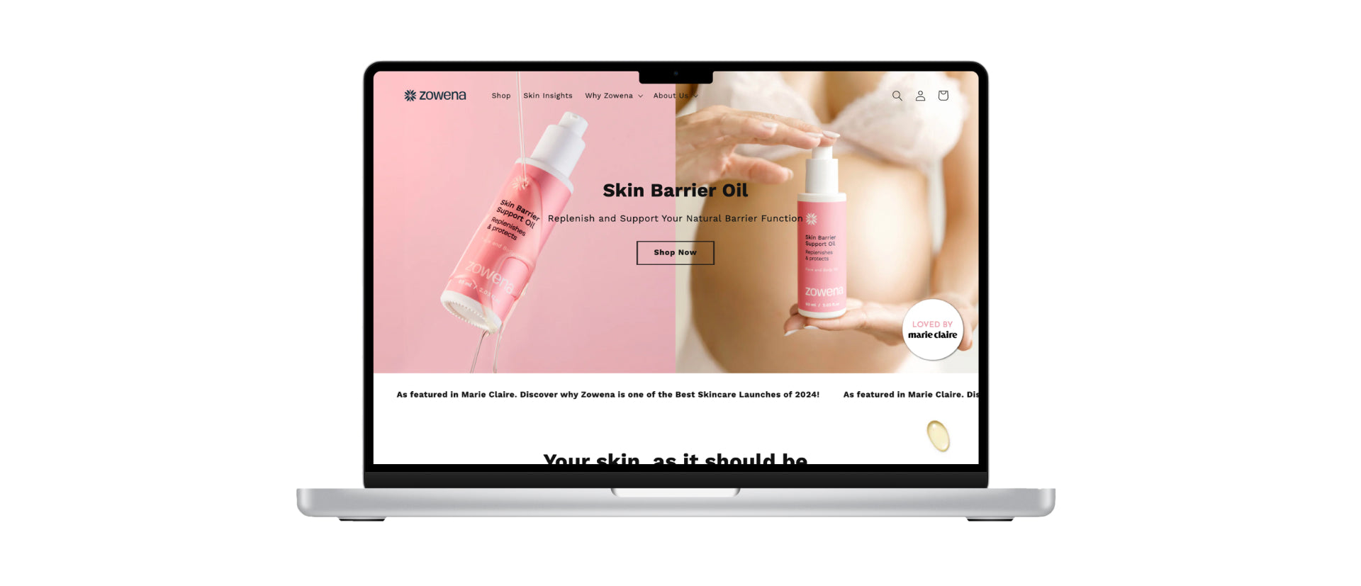
The redesign, which was designed and developed directly in Shopify, prioritises a clear, intuitive journey for users, whether they are new to the brand or returning to learn more about the product’s benefits. To achieve this, I customised the site using CSS, HTML, and Liquid code - tailoring components and layouts to ensure the experience felt cohesive, accessible, and aligned with Zowena’s brand ethos. The focus was on creating a warm, educational, and trustworthy space that makes it easy for users to explore the brand, understand its values, and find the perfect skincare solution.
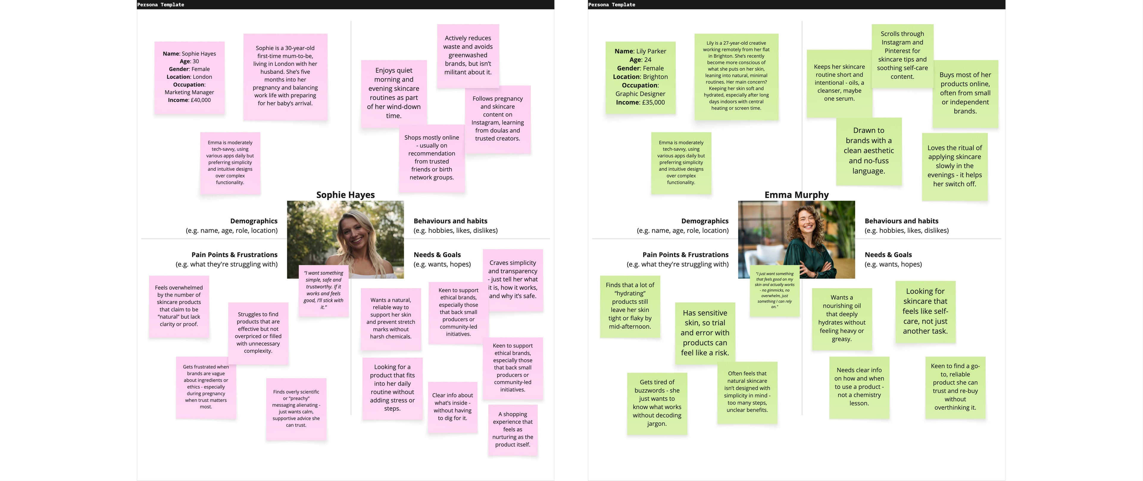
Understanding the Audience:
Zowena’s ideal customer may be a skincare-conscious first-time mum, but the beauty of the brand is that it resonates far beyond that. Originally formulated with pregnancy in mind - prioritising safety, gentleness, and effectiveness - Zowena’s nourishing oil is also a favourite among anyone with sensitive or dry skin. Its lightweight, fast-absorbing texture makes it easy to slot into any skincare routine, whether you're tackling stretch marks or just need a daily boost of hydration. With ingredients you can trust and a calming, no-fuss experience, it’s the kind of product that quickly becomes your go-to - not just during pregnancy, but long after.
When approaching this redesign, it was clear that the site needed to feel personal and relatable. By simplifying the structure of the website and making information accessible, we ensure that even new visitors can quickly find the answers they’re looking for. The goal was to create a space where potential customers could feel confident in their skincare choices, knowing they are supported by scientific formulation and ethical practices.
Research and Brand Ideology:
The redesign was built around Zowena’s commitment to natural, plant-based ingredients and sustainability. This brand does not just want to sell a product – it wants to educate and empower users about the ingredients they are using. By focusing on transparency, the new website now features clear information about the sourcing of Zowena’s ingredients, the ethical standards behind the brand, and a deeper look into the handcrafted nature of the products.
The founder’s story is woven into the site’s design, helping to create a personal connection with the audience. Raised in South Africa on a farm, surrounded by natural resources and steeped in the wisdom of plants, the founder’s commitment to quality and sustainability is central to the brand. The site now prominently features this story, further aligning the brand with its values of authenticity, quality, and community.
Design and User Experience:
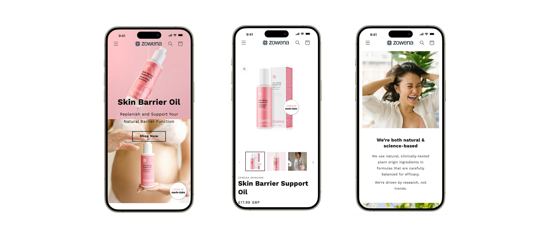
The redesign focuses on a user-friendly layout, with clear call-to-action buttons, intuitive navigation, and a straightforward purchase process. The main goal was to remove barriers, ensuring that users can easily access product information, learn about the benefits of the oils, and confidently make a purchase.
Key features of the redesign include:
Clear Typography and Language: The typography is clean and legible, with easily readable fonts that ensure the information on the site is accessible to all users. The language used is warm, approachable, and educational, aligning with the brand's commitment to supporting and informing users without overwhelming them.
Brand Colours and Imagery: Zowena’s natural green hues are used to evoke a sense of trust, purity, and connection to the earth. Green, symbolic of growth and nature, serves as a visual reminder of the botanical origins of the skincare oils. The soft pink accents help to create a sense of comfort and care, reflecting the brand’s commitment to nurturing its users’ skin while providing a calming, supportive experience. This balance of natural tones reflects Zowena’s core values of combining nature with science, bringing warmth and gentleness to the design.
Real Imagery and Testimonials: The website now features authentic images of real users of the product. These images help convey the tangible benefits of the oils and create an emotional connection with the audience. Real quotes from the founder, explaining the ethos and mission behind Zowena, add an extra layer of trust and transparency, ensuring that users feel confident in the brand’s commitment to quality.
Ingredient Transparency: One of the most important aspects of the redesign is ingredient transparency. Zowena’s users want to know exactly what goes into their skincare products. With this in mind, the product pages clearly outline the ingredients used in each formula, where they are sourced from, and the role each ingredient plays in achieving the desired skincare results. This empowers customers to make informed choices about the products they use.
Sustainability and Ethical Sourcing: The redesigned website also emphasises Zowena’s commitment to sustainability. The brand’s ethical sourcing practices, including direct relationships with South African farmers and a focus on plant preservation, are clearly communicated. This aligns with the growing consumer demand for ethically sourced, sustainably produced goods, and assures users that their purchase supports local communities.
Educational and Emotional Connection:
Beyond providing product information, the website aims to create a sense of empowerment for users. The redesign incorporates educational content that explains the benefits of each ingredient, how they work together to support skin health, and why they are safe for both mum and baby. This is coupled with clear, reassuring messaging that Zowena’s products are designed to work with the skin, not against it.
By providing a beautiful, calming online environment, Zowena’s website fosters a sense of confidence and calm, encouraging users to embrace their bodies’ natural changes. The emotional benefits of using Zowena are at the forefront of the messaging: healthy, nourished skin, increased self-confidence, and the reassurance that users are making a positive choice for themselves and their babies.
The Power of Transparency and Trust:
In a market where greenwashing is common, the redesigned website positions Zowena as a transparent, honest brand that does not shy away from showcasing exactly what goes into its products. By keeping users informed at every step of their journey - from ingredient sourcing to product use - the redesign ensures that Zowena is a brand that customers can trust.
The website also features sections that speak directly to concerns about stretch marks, offering a more realistic, science-based approach to stretch mark prevention. The messaging is clear: Zowena’s oils are not a cure for stretch marks, but a preventative solution that works with the body’s natural processes to help support skin health during pregnancy.
Conclusion:
The redesign of the Zowena website successfully captures the essence of the brand: a natural, scientifically-backed skincare solution that empowers users to feel confident and cared for. By focusing on clarity, transparency, and authenticity, the site now serves as an accessible, informative space for users to engage with the brand and confidently make purchase decisions. Whether users are seeking to prevent stretch marks, nourish their skin, or simply learn more about the benefits of natural skincare, the Zowena website now offers an experience that is as nurturing as the products themselves.
Curious to see it in action?
Explore the full redesign on Figma and see how each decision comes to life.