
Redesigning Irish Rail: Making Booking Simple
The Irish Rail app has long been a daily companion for commuters across the country, yet its usability issues are just as familiar. Booking a train ticket should be quick and stress-free, but for many, the app’s confusing flow and clunky checkout process created friction where there should have been ease. As part of my UX design module, I set out to reimagine the app, not by overhauling everything, but by refining what already exists to work better for the people who rely on it.
This project focused on one core goal: to improve the experience of booking a train ticket. That meant addressing the frustrations users felt, simplifying the interface, and designing a smoother, more intuitive checkout process grounded in real-world feedback.
Listening to Real Experiences
To understand where things were going wrong, I spoke directly with users, gathered survey data, conducted interviews, and carried out multiple rounds of usability testing. A few pain points kept resurfacing - people were being redirected out of the app to complete bookings in a browser, having to enter their information more than once, feeling confused by unclear seat selection options, and unsure what certain features like the live map or alarm were even for.
To broaden the scope, I analysed over 100 app store reviews, identifying recurring complaints about limited functionality, confusing navigation, missing information, and a general lack of clarity in the app’s structure.
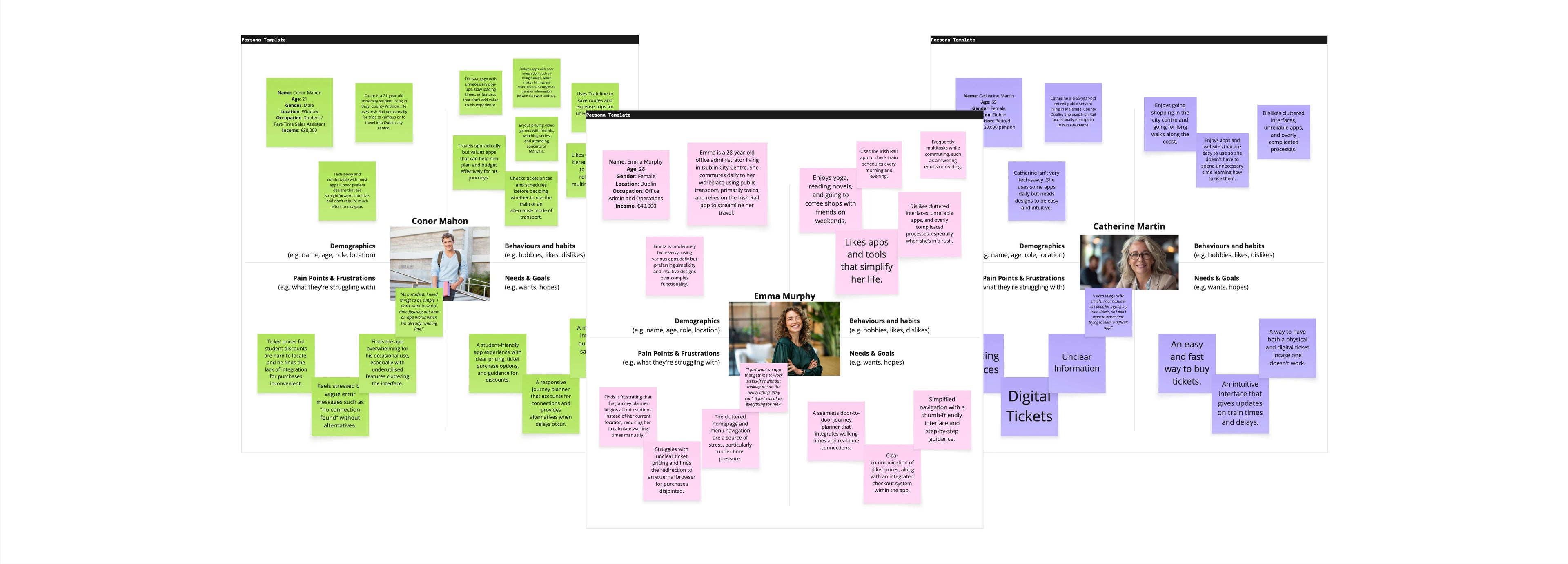
I took all of this data, from usability tests, interviews, surveys and reviews, and combined it to create three core personas. The personas represented Gen-Z, Millennial and Boomer, to provide a wide range of user groups and give a deeper understanding of their needs. These personas were not created in isolation but were informed by the recurring pain points, feedback patterns and based on real-life users. They helped guide the redesign from both a functional and emotional perspective, anchoring the work in real experiences.
Learning from What Works
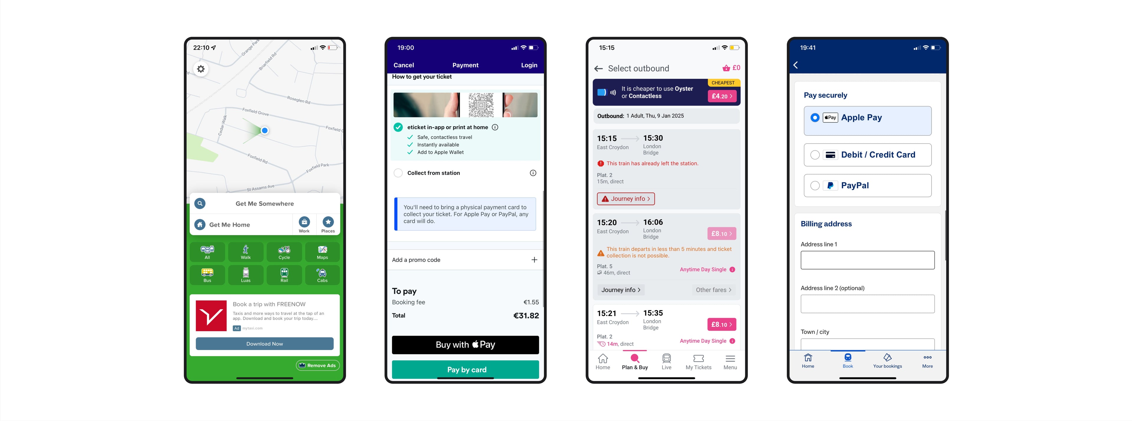
To benchmark best practices and get ideas for improvement, I analysed competitors like Trainline, Eurostar, Citymapper and Thameslink. These platforms offered a variety of smart solutions: clearer step-by-step flows, multi-modal planning, real-time updates, and streamlined checkouts. Mapping out their flows made it clear just how time-consuming Irish Rail’s current process was by comparison.
Inspired by what worked elsewhere, I began designing a checkout flow that would minimise friction, eliminate redundancy, and give users the flexibility and clarity they needed.
Refining the Experience
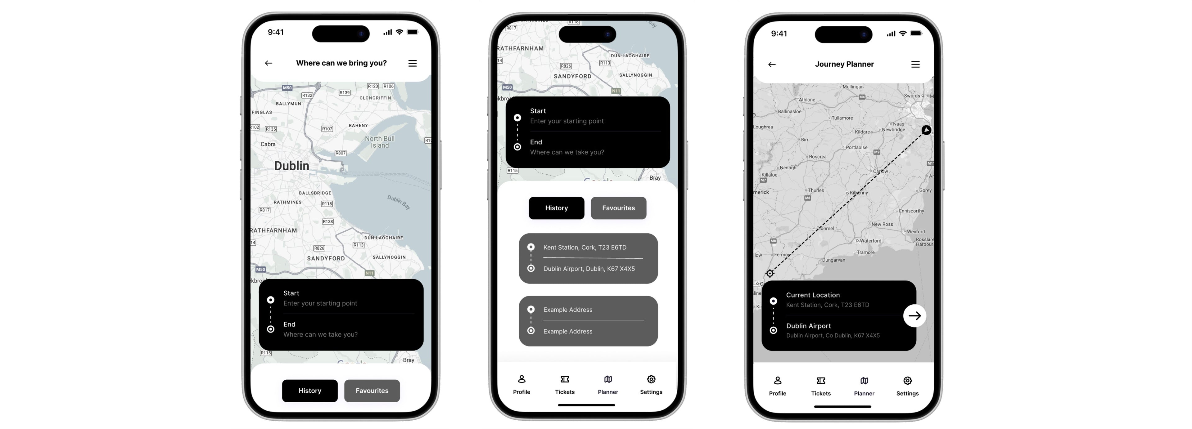
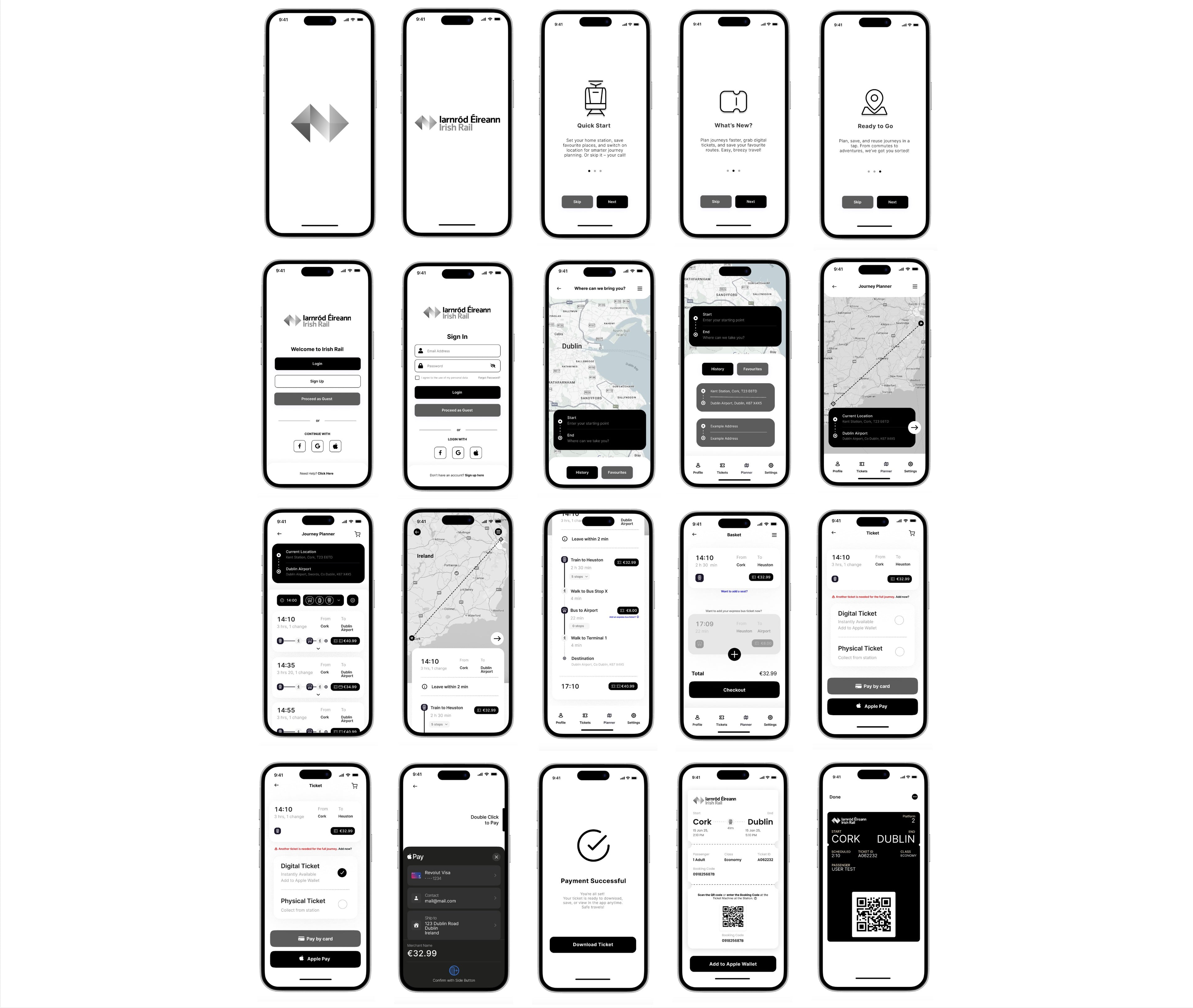
With the research in place, I moved into sketching wireframes and developing ideas. I aimed to create monotone prototypes that focused purely on functionality. By avoiding design distractions, I was able to concentrate on what really mattered, reducing steps and improving flow.
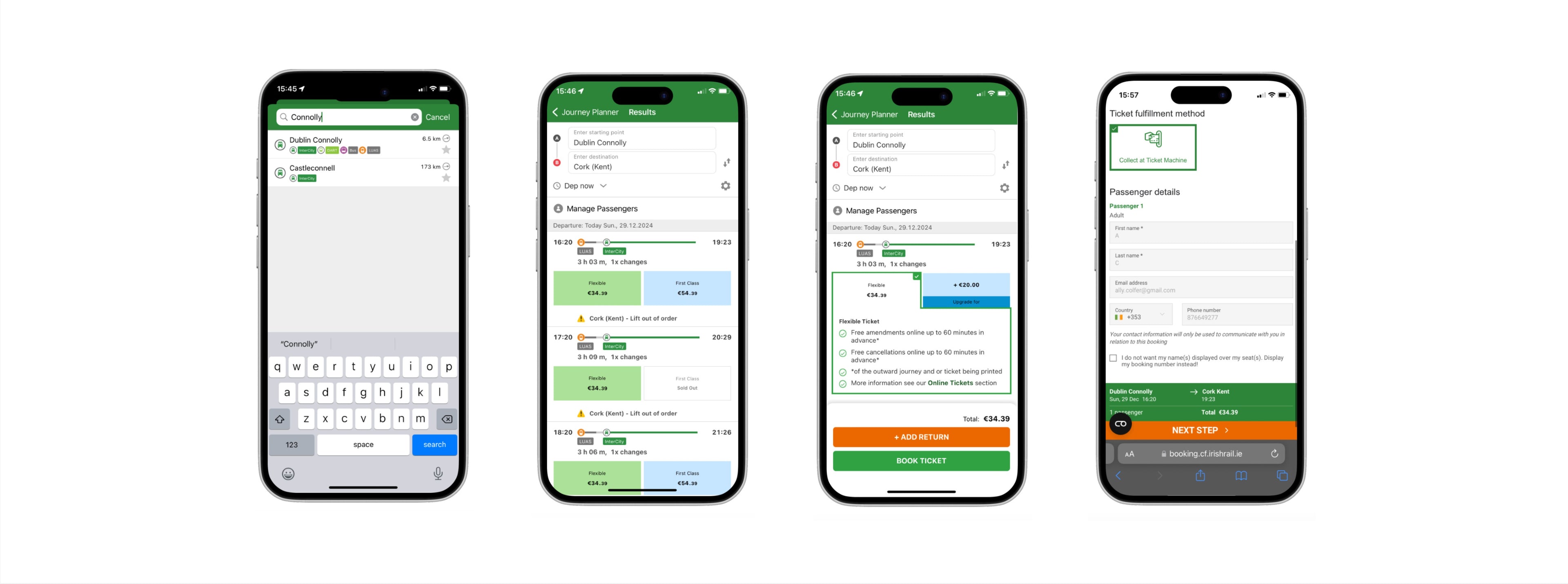
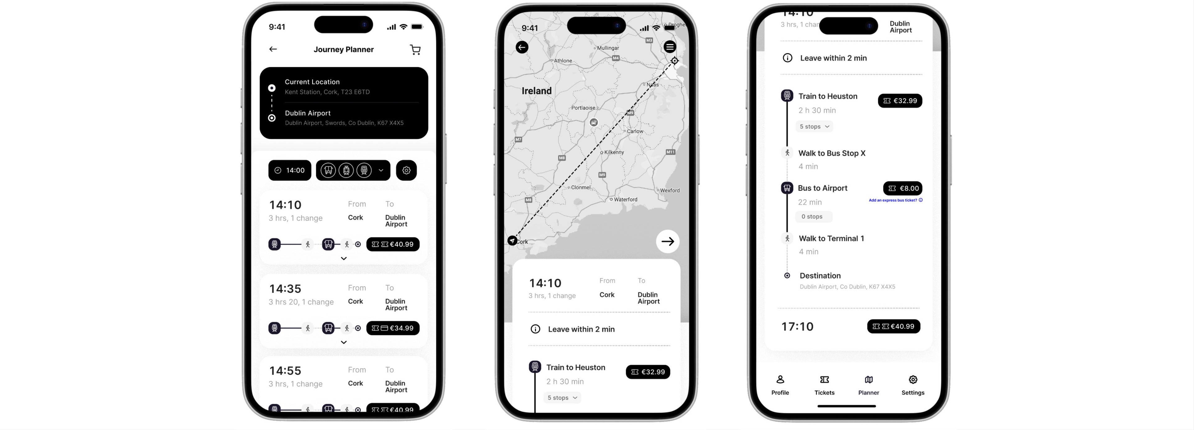
A door-to-door journey planner was one of the first major features I rethought. Instead of starting from the nearest station, users could begin planning from their current location, cutting out unnecessary steps and reducing friction. This also gave them a clearer and more accurate estimate of their total journey time.
To improve the readability and structure of information, I used accordion menus. These help break content into manageable pieces and reduce cognitive load, allowing users to expand travel details only when needed. This was particularly useful in avoiding overwhelming users with too much information at once.
For those planning more complex trips, I added the ability to see and compare multiple route options based on location, time and ticket flexibility. This helped give users a sense of control and clarity, echoing features from Citymapper and Thameslink.
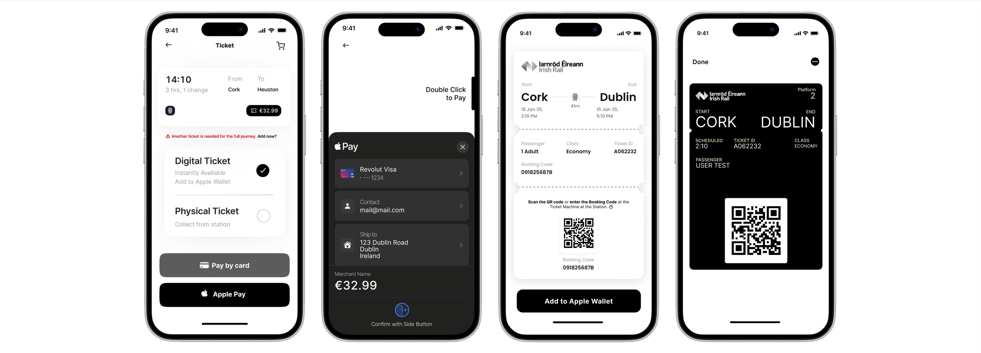
Another key change was the inclusion of a guest checkout. Many users in testing said they didn’t want to create an account just to buy a ticket, and research from the Nielsen Norman Group supports this approach. It reduces barriers and encourages smoother, faster transactions.
Offering Apple Pay alongside traditional card entry allowed users to pay quickly using saved credentials. Research shows that providing familiar, streamlined payment methods reduces checkout abandonment and boosts user satisfaction.
Navigation in general was a significant challenge. The original app used a combination of hidden menus and floating buttons, leading to frequent user confusion. To address this, I introduced a bottom navigation bar with persistent, clearly labelled icons for Plan, Tickets, Map and Account. This created consistency and helped users orient themselves without having to relearn the interface each time they used it.
The live map and journey planner were previously disjointed, which meant users often didn’t even know the map existed. I merged them into one cohesive space, improving visibility and usability. Now users could view real-time routes while planning, making adjustments as needed, all in one place.
Testing and Iterating
I tested my prototypes through both freeform and task-based usability sessions. In the freeform stage, users explored the app independently and gave spontaneous feedback. In the structured sessions, I asked them to complete tasks such as planning a journey, selecting seats, checking out as a guest, and choosing between physical or digital tickets.
The feedback highlighted specific areas for improvement. Some users were still too focused on the old app’s colour palette and layout, while others were confused by unclear pathways. This prompted a second round of changes that refined the structure, reworded labels, and improved visual hierarchy.
What I Learned
Throughout the project, I learned the importance of stepping back from the interface to view the full experience. Initially, I was too focused on matching colours and refining individual frames. Shifting the focus to structure and function made the design stronger.
Another key lesson was learning not to lead users too much during testing. When I let them explore naturally, I gained far more valuable insights into their expectations and mental models.
By grounding the redesign in real user feedback and keeping the focus on simplicity, clarity and flexibility, I created an experience that makes planning and booking travel feel more fluid. Because in the end, a good app should work quietly in the background, supporting users without slowing them down.
This project wasn’t about adding more. It was about helping users do less, more easily.
Curious to see it in action?
Explore the full redesign on Figma and see how each decision comes to life.
Interested in seeing the full research process? Get in touch!
- Choosing a selection results in a full page refresh.
- Opens in a new window.