
Redesigning Google Scholar: Designing for Everyone
Google Scholar has long been a go-to for students, academics and researchers. But while it’s packed with valuable content, it doesn’t always support the people who need it most. As part of my UX design module on universal design, I set myself the challenge of rethinking how Google Scholar could be redesigned to better serve users with disabilities, impairments and neurodivergence.
This wasn’t about surface-level tweaks or adding a few accessibility features. I wanted to rethink the entire experience so that anyone could explore, research and learn without unnecessary barriers. For me, universal design means building something that supports everyone from the start, not just retrofitting solutions later. It should work intuitively for those with different needs, while still feeling effortless for those without. The goal was to make something that felt familiar, but fundamentally more supportive.
Understanding the Barriers
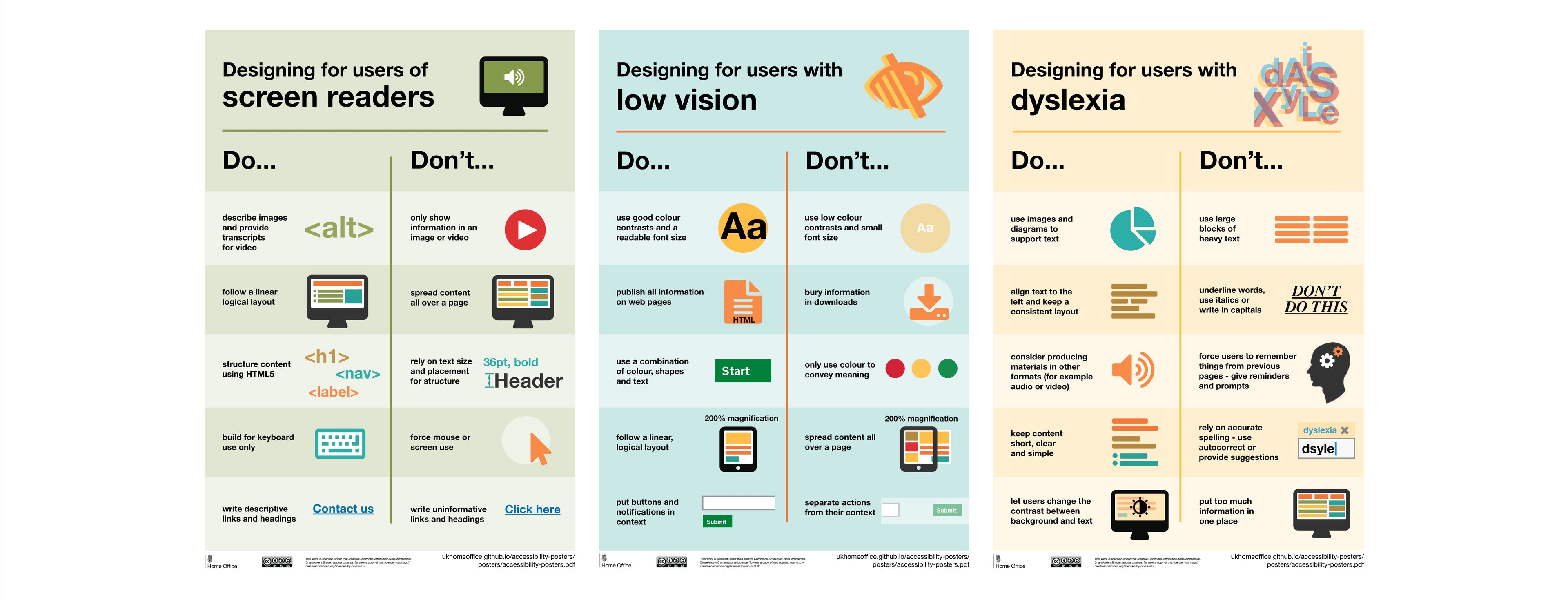
I began by immersing myself in the foundations of accessibility, inclusive design and universal design. I explored how typography, colour, contrast, layout and motion can affect people with dyslexia, ADHD, dyspraxia, nystagmus, colour blindness, cerebral palsy, low vision and other impairments. I studied WCAG guidelines, combed through best practices, and tested tools like disability simulators to better understand the digital barriers many people face.
But the real turning point came when I moved beyond the theory and started speaking to people. I interviewed two users with nystagmus, three dyslexic users, and one user with ADHD and colour blindness. Their feedback shaped everything that came after.
One of the nystagmus users described the sheer difficulty of navigating dense academic text when your eyes don’t stay still. She often loses her place mid-paragraph, and spoke about how an underline or highlight feature could help anchor her visually. She also pointed out that reading for long periods causes visual fatigue, and that an audio option would help her absorb information more easily.
The dyslexic users all talked about how overwhelming the current layout of Google Scholar feels. From the cluttered interface to the small font sizes and poor contrast, the experience was tiring and difficult to engage with. One user explained how she uses colour-coded highlighting and pairs audiobooks with physical reading to help her process information. Another simply wanted more control over font size, spacing and colours.
The ADHD and colour blind user echoed similar frustrations. He found the layout distracting, particularly the unused space with floating PDF and HTML links that made it hard to concentrate. He also wanted a better way to manage saved articles, with less clutter and clearer visual organisation.
From Real Conversations to Real Personas
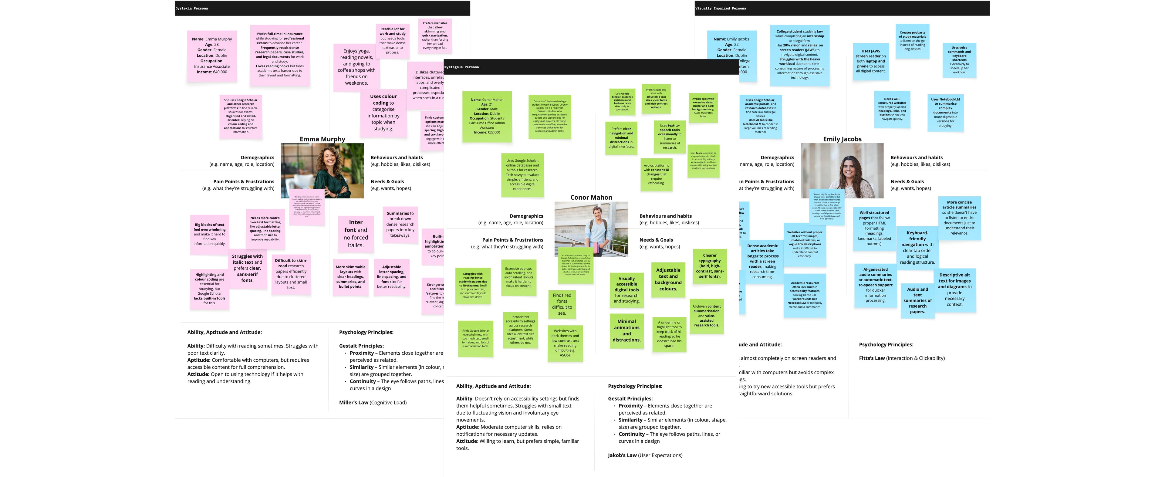
To keep the design grounded in real needs, I created three personas drawn directly from these conversations:
Conor Mahon is a university student with nystagmus. He experiences involuntary eye movement, which makes it difficult to follow lines of text and stay visually anchored when reading. He needs clear visual markers like highlights, minimal visual clutter and alternative ways to consume information, such as audio support, to reduce fatigue during long study sessions.
Emily Jacobs is a postgraduate researcher with low vision. She relies heavily on screen readers and keyboard navigation, and prefers tools like ChatGPT and NotebookLM that help her summarise, organise and digest large amounts of information quickly. For her, a clean layout, descriptive buttons and seamless compatibility with assistive tech are essential.
Emma Murphy is a dyslexic student who benefits from multisensory learning. She often combines audio and text, uses colour coding to support comprehension, and requires options to adjust font, spacing and colour themes to reduce strain. A calm, readable interface helps her focus and process content without becoming overwhelmed.
These three people became the lens through which I viewed every design decision. They represented real, specific needs, but also helped me imagine how design could quietly benefit many more users facing similar challenges.
Finding the Gaps
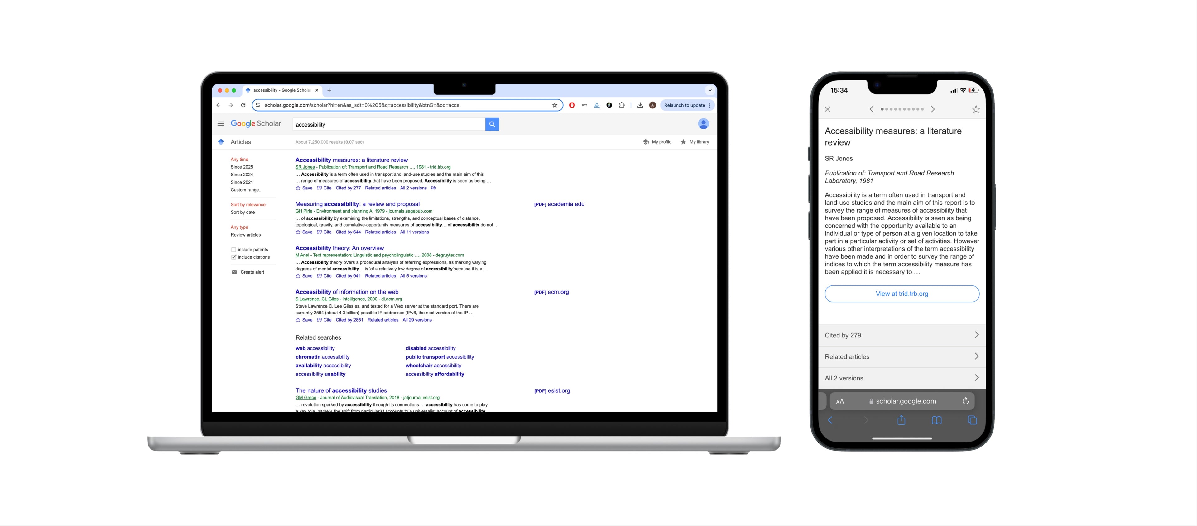
Before jumping into design, I audited the existing Google Scholar experience using accessibility tools like Google Lighthouse and contrast checkers. The issues were clear: low-contrast text, non-descriptive links, very small clickable areas, and no personalisation features for text size, spacing or colours. There was no audio support, no accessibility settings, and only basic filtering options. The structure simply wasn’t set up to accommodate the needs of users who process information differently.
Learning from What Works
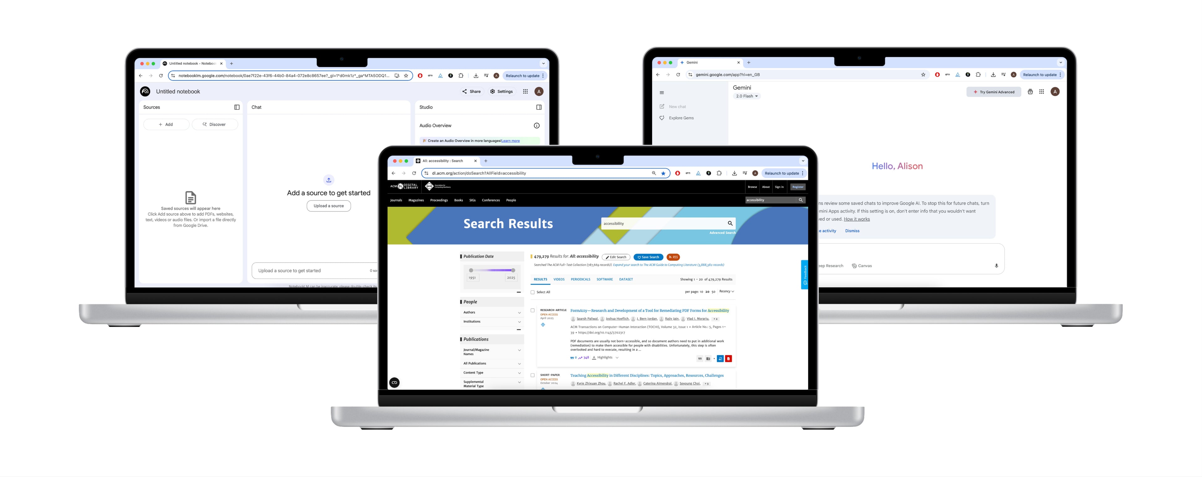
To inform the redesign, I explored a range of platforms. I looked at academic databases like JSTOR, PubMed, World Digital Library, ACM and Semantic Scholar to understand how they structure content and filters. I also took inspiration from tools my interviewees actually used in their own work: NotebookLM and Gemini, both AI-powered tools that help users summarise, organise and understand content faster. Their clean, modern interfaces stood out as being more accessible and less overwhelming. Audible also came up in conversation, particularly with one dyslexic user who explained how she listens to books while reading along, helping her stay focused and better retain information.
Reimagining the Core Experience
With all of this in mind, I started to rework Google Scholar’s experience to be more thoughtful, more customisable and above all, more inclusive.
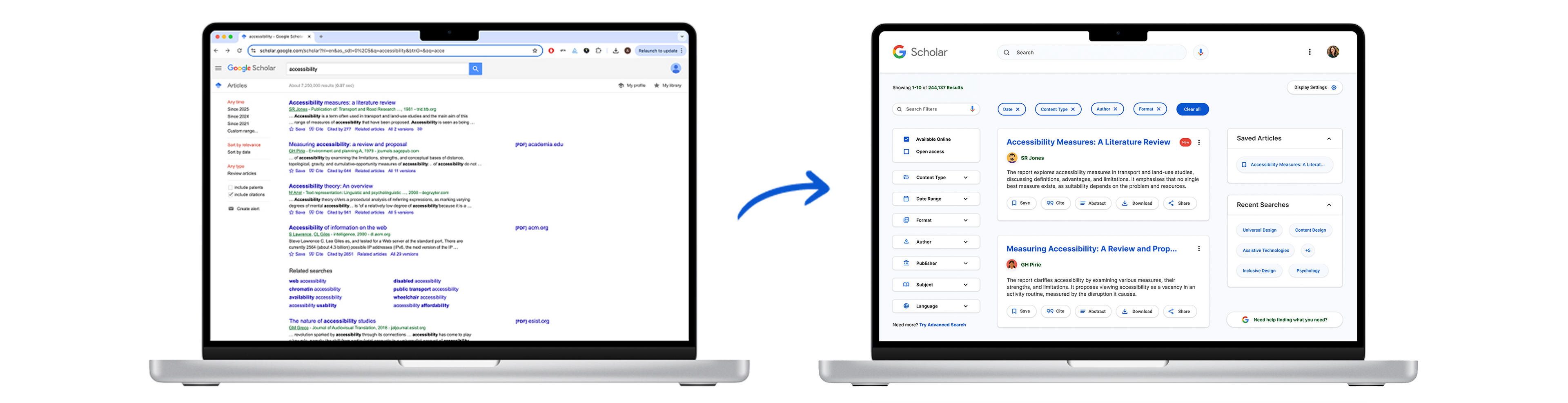
One of the first changes I made was chunking content into individual cards with soft shadows. Instead of long, continuous blocks of text, users now see information grouped clearly, following the Gestalt principle of proximity. This not only reduces cognitive load but also makes it easier to scan and understand at a glance. It was a small visual shift that made a big difference, particularly for users like Conor who struggle to track lines of text, and Emma, who benefits from clean separation between elements.
Next, I turned my attention to the article snippets. The current setup offers disjointed bits of text with bolded keywords, which several dyslexic users said made it harder to understand the content. I replaced these with clearer, more coherent summaries that help users judge relevance straight away. This shift also aligns with best practices in UX content strategy, giving users the right information at the right moment, and reducing the effort needed to scan and decide.
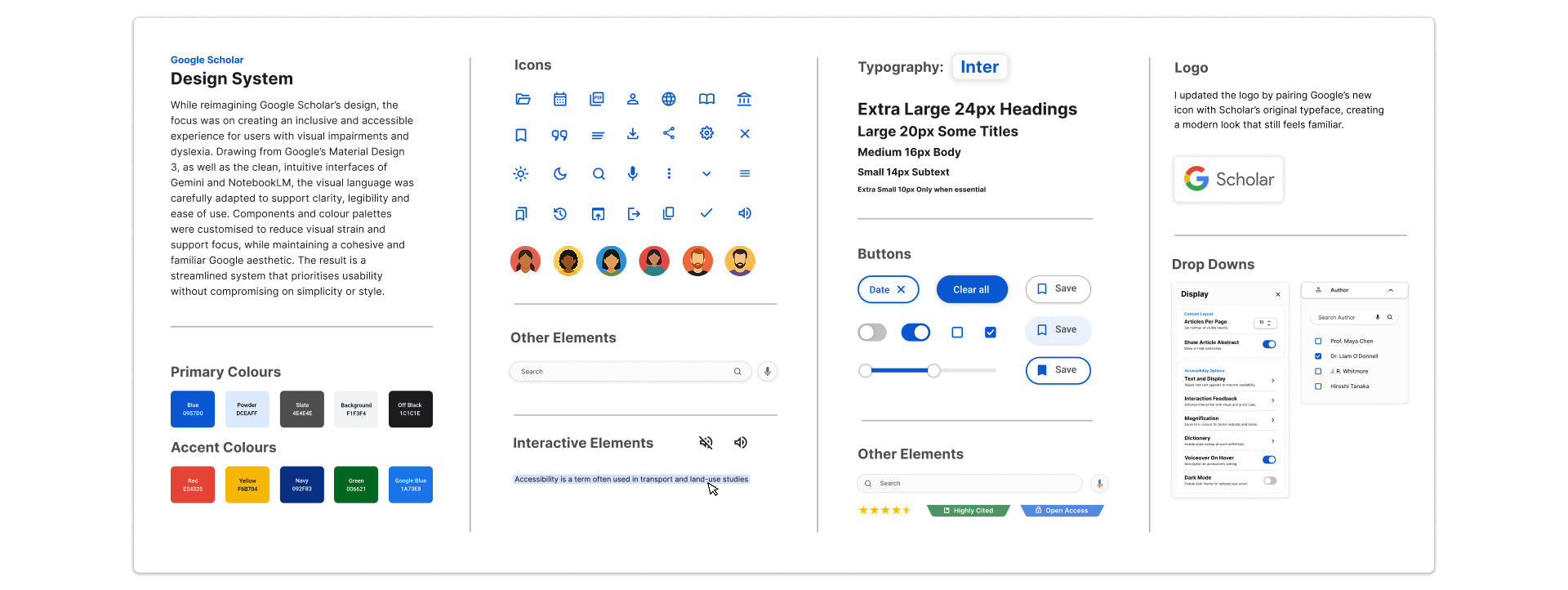
Filtering was another area I completely rethought. The original filters felt limited and hidden. Drawing inspiration from ACM and World Digital Library, I created a dynamic filter system with top-level tags and search options. Users can now filter by author, content type, file format and more. For users with ADHD or dyslexia, being able to quickly narrow things down without getting lost in menus makes a massive difference.
AI tools became an essential part of the redesign. Both the visually impaired and dyslexic users talked about how they already use AI platforms to summarise or help with note-taking. I integrated similar tools directly into the experience, so users can access help without needing to leave the platform. This supports faster comprehension and gives users control over how they consume academic material.
The highlight and underline feature came directly from the nystagmus users’ feedback. Because their eyes often shift involuntarily, they can lose their place on the page. Highlighting offers a visual anchor to help keep their focus. Research backs this up, showing that structured highlighting improves comprehension and reading speed, especially for people with attention challenges or visual tracking difficulties.
Audio support was another feature users consistently asked for. For someone with dyslexia or visual fatigue, having the option to listen to an article can transform the experience. Including a built-in audio feature means users don’t have to rely on external apps or learn screen reader software. It’s all there, simple and accessible for anyone who may benefit from the feature.
Customisation and Visual Comfort
A key part of making the interface more inclusive was allowing users to customise it to suit their needs. I designed an accessibility panel where users can change font size, letter and line spacing, and colour settings. They can also switch between light and dark modes, which offers greater flexibility depending on the user's needs. Dark mode can be particularly helpful for users with low vision or light sensitivity, as it reduces glare and can make screen reading more comfortable over long periods. One of the dyslexic users I spoke to also mentioned that she prefers a darker background with light text, as it feels less intense on her eyes and helps her to focus more easily on the content.
Rather than using stark black text on a white background, which can strain the eyes over time, I opted for dark greys and soft colours like blue and yellow. These tones are known to support readability for dyslexic users and reduce visual fatigue. I also removed hard-to-read colour combinations, like light grey or red on white, replacing them with accessible alternatives, like blue and green, that maintain clarity and contrast.
To support keyboard users and those with low vision, I added visual indicators to every interactive element. Buttons are clearly labelled, icons are meaningful, and tabbing through the page now makes it easy to track focus. These may seem like small details, but they make a huge difference to someone navigating the page without a mouse.
Building a Cohesive System
The final design system was built on the principles of Google Material Design 3, but adapted to suit the needs of a more diverse user base. I drew inspiration from the clean, well-organised layouts of Gemini and NotebookLM, keeping the interface light and calm while preserving Google’s familiar visual language from their more up-to-date platforms like Google Meet.
Typography played an important role. I chose Inter, a typeface designed specifically for digital readability. It has a tall x-height, open counters and balanced letterforms that make it easier to scan, especially in small sizes. To validate the choice, I tested it with dyslexic users against other commonly used accessible fonts - Arial, Roboto and Open Sans. Two out of three users preferred Inter, saying it felt clearer and significantly easier to read. Taking into account both this feedback and the strong accessibility-focused design of Inter, it made the most sense to go with it to create a user experience that feels clean, professional, and, most importantly, accessible, ensuring content is approachable for as wide an audience as possible.
I also designed author icons to introduce a bit of warmth and personality into the interface. They provide subtle bursts of colour without affecting accessibility, and help users visually scan through articles more easily.
A Platform That Works for Everyone
This project wasn’t about tearing down what already worked. It was about recognising what Google Scholar already offers and building on it in a way that made it feel more human, more supportive, and more inclusive for those who’ve often been overlooked. It was about reimagining how it could better support everyone who relies on it. Through in-depth research, real user feedback and a commitment to universal design, I created a system that removes barriers rather than adding to them.
Good design shouldn’t demand extra effort. It should support people quietly in the background, allowing them to focus on what they came to do. For Google Scholar, that means making research not just accessible, but genuinely usable for all.
Curious to see it in action?
Explore the full redesign on Figma and see how each decision comes to life.
Interested in seeing the full research process? Get in touch!