
Designing Eco Map: Making Sustainability Simple
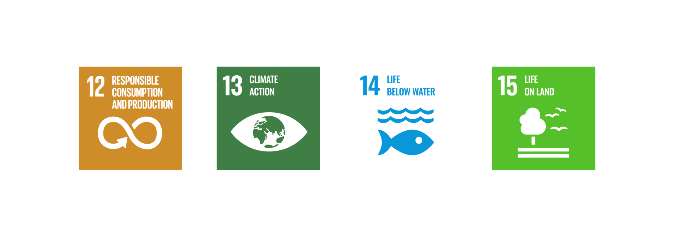
As part of my first UX design module, I set out to create an app that didn’t just inform users about environmental issues, but genuinely supported positive behaviour change. Using the Design Thinking framework, I aimed to build something functional, intuitive and rooted in empathy. The result was a concept for a sustainability app inspired by UN Goal 14: Life Below Water, focused on reducing water pollution through real-world user action.
The Challenge: Designing for Environmental Change
We began by reviewing all 17 UN Sustainable Development Goals, eventually deciding on Goal 14: Life Below Water. Ocean pollution felt urgent, visible and solvable with the right tools. The data backed it up. Over 5 trillion plastic particles are floating on the ocean’s surface, creating devastating long-term effects for marine life and ecosystems. We knew we wanted to design something that made environmental impact feel achievable for everyday users.
Why Design Thinking?
After completing a UX foundations course on LinkedIn Learning and digging deeper into the methodology, I decided to structure the entire project around the Design Thinking process. Its empathetic, iterative nature gave me a strong foundation to keep real users at the centre of every decision - not just in research, but throughout ideation, prototyping and testing.
Research and Competitor Analysis
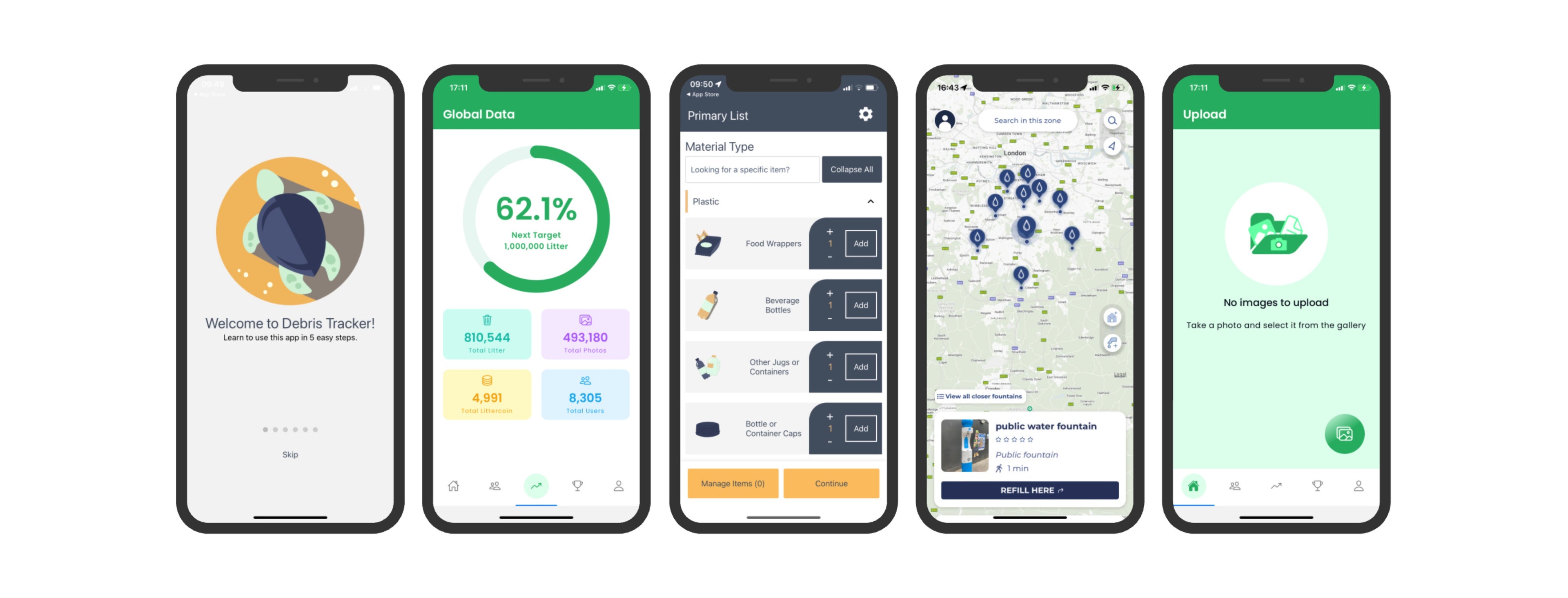
Our first instinct was to find what already existed. One app that stood out early on was Marine Debris Tracker. At a glance, it had potential, but the interface wasn’t intuitive and didn’t feel accessible or engaging. That opened the door to create something more useful and enjoyable to use.
From there, we expanded our scope to explore related areas: apps supporting recycling, water bottle refilling, plastic tracking, and sustainable habits. We looked into features that worked, features that didn’t, and more importantly, what users were actually saying in online reviews.
Apps like Open Litter Map and Closca introduced helpful ideas around visual mapping, social accountability and usability. I also carried out heuristic evaluations using Jakob Nielsen’s usability heuristics to break down strengths and weaknesses in each competitor. This helped ensure that any new features we introduced weren’t just appealing, but genuinely improved usability.
Defining the Users
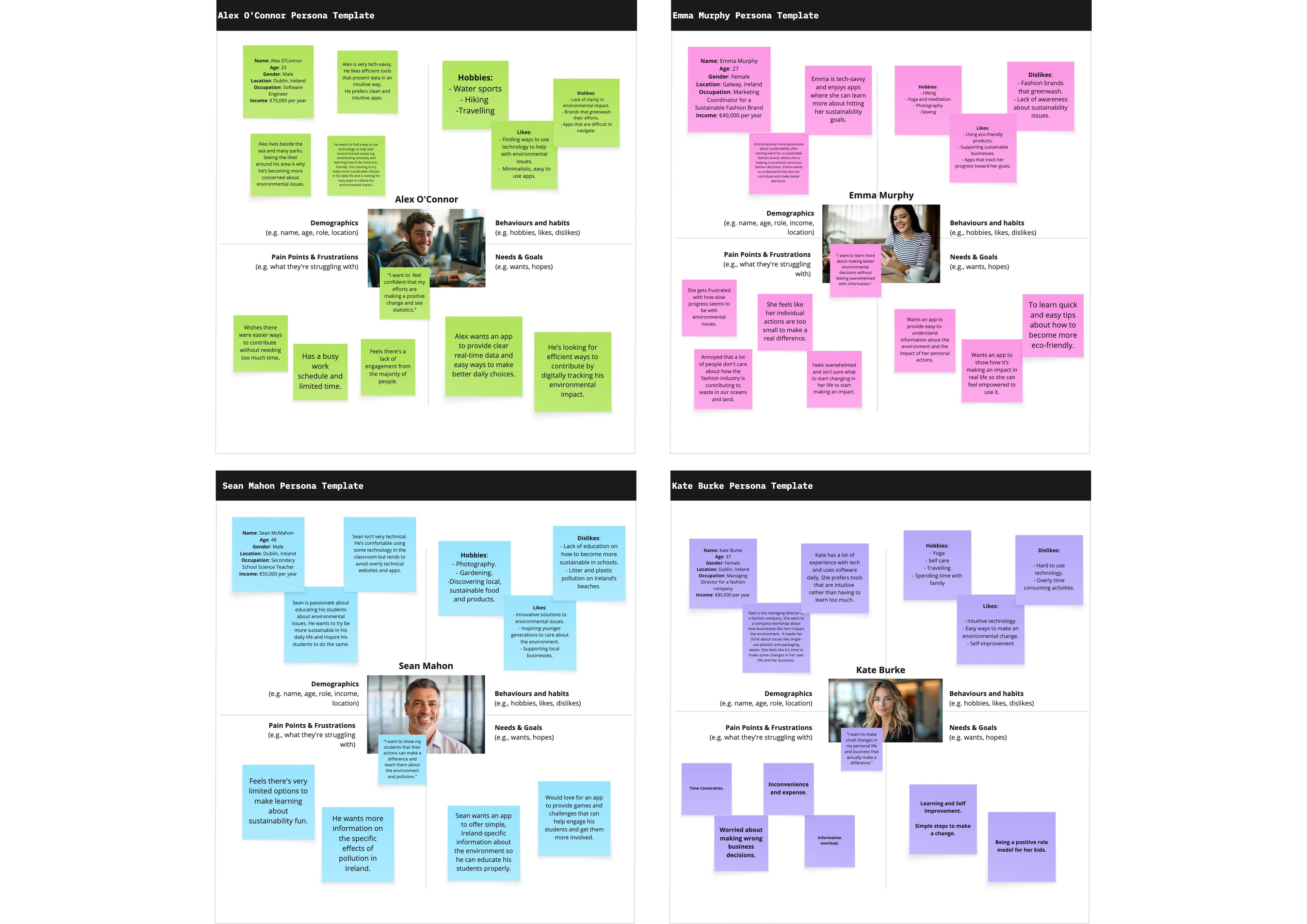
To ground the ideas in real needs, I created four distinct personas across Gen Z, Millennial and Gen X users. Each represented a different relationship with environmental issues.
Alex (23) is a software engineer who lives near the sea. He’s motivated to reduce local waste and wants a clear, data-driven way to contribute.
Emma (27) works in sustainable fashion and looks for tools that align with her lifestyle and values.
Sean (48) is a science teacher using apps to show his students the value of environmental action.
Kate (37) is a managing director rethinking how her company handles packaging waste.
These personas helped focus the feature design and tone of voice. Whether users were highly motivated or just starting their sustainability journey, we wanted the app to feel approachable and motivating, not preachy or complex.
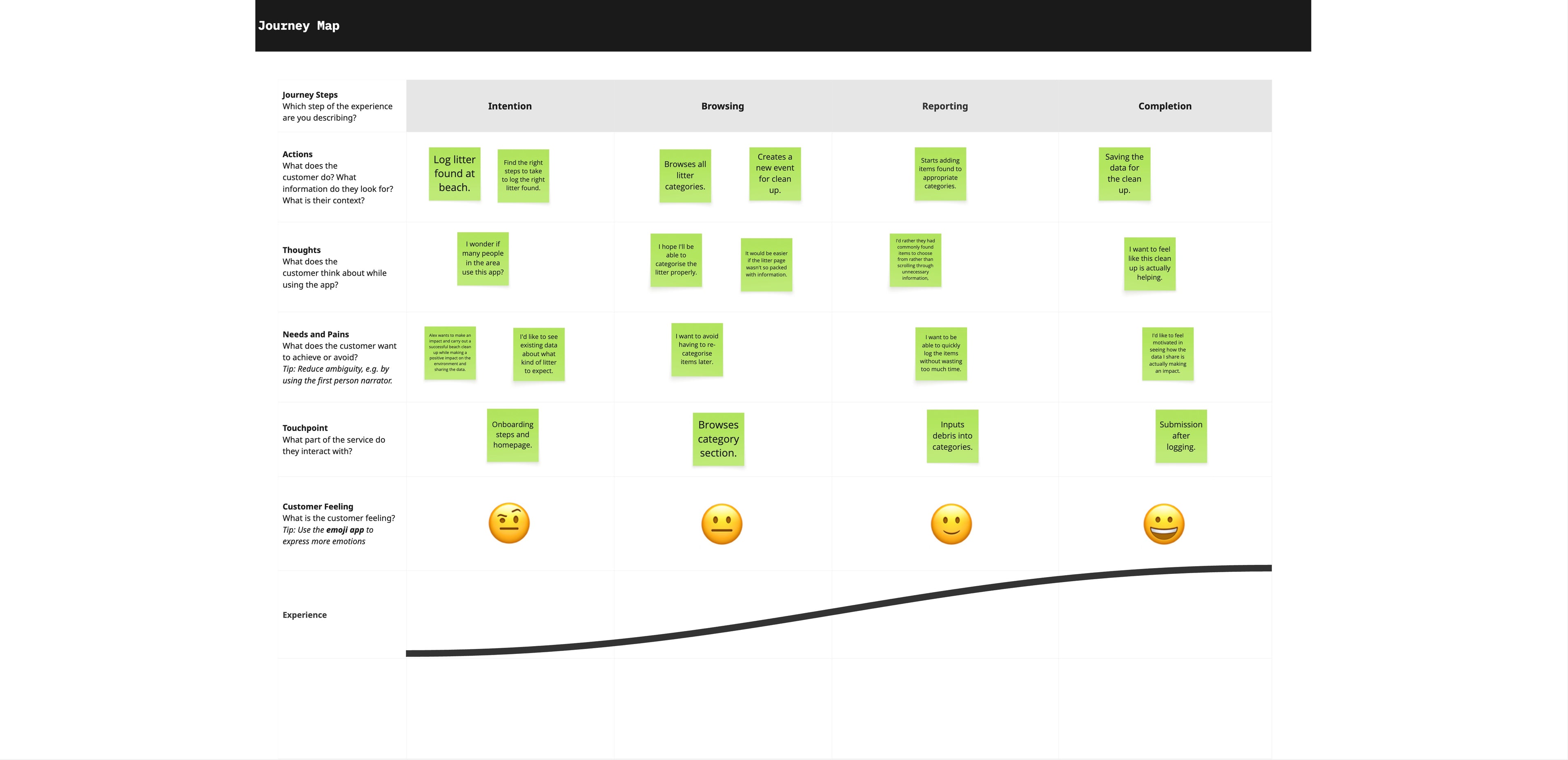
Mapping the Journey
Empathy maps and journey scenarios helped flesh out how each user might interact with the app. This ensured the interface was rooted in practical scenarios - not assumptions.
It also highlighted gaps we hadn’t considered, like how important it would be to make the experience feel rewarding and quick. That led to a key decision: we needed a gamified element.
Ideation and Feature Design
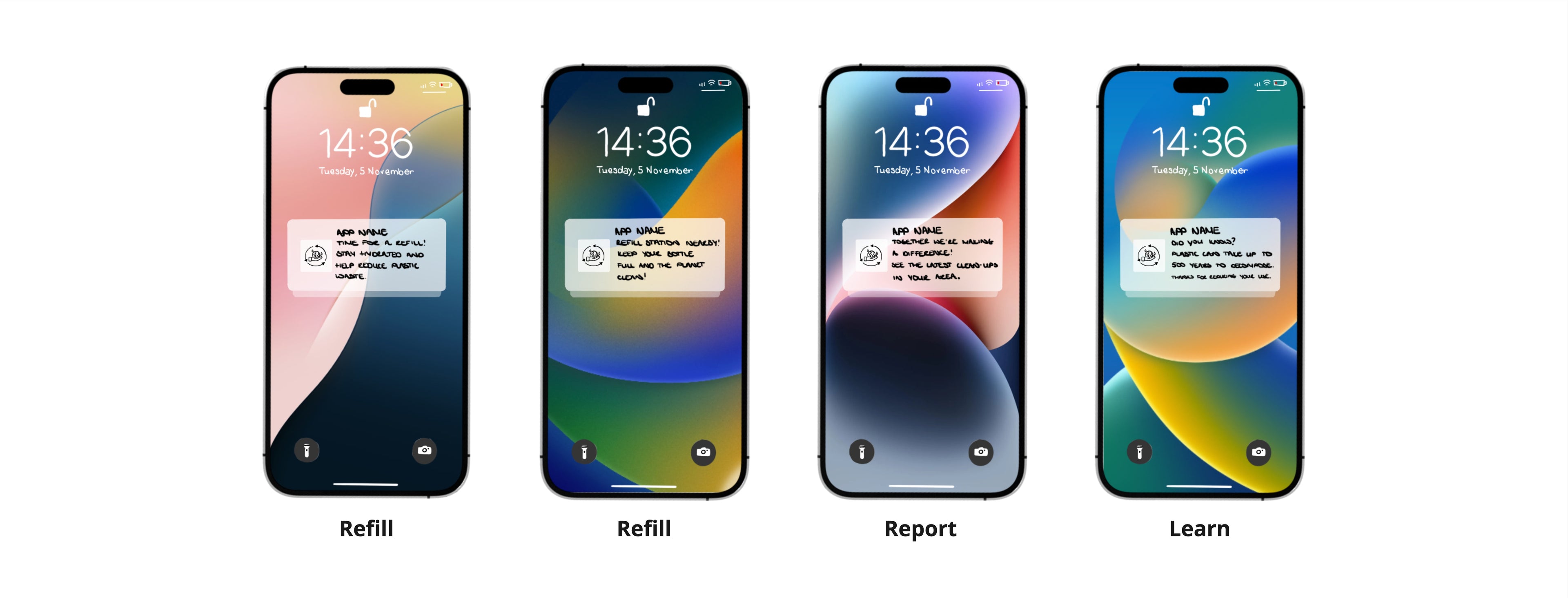
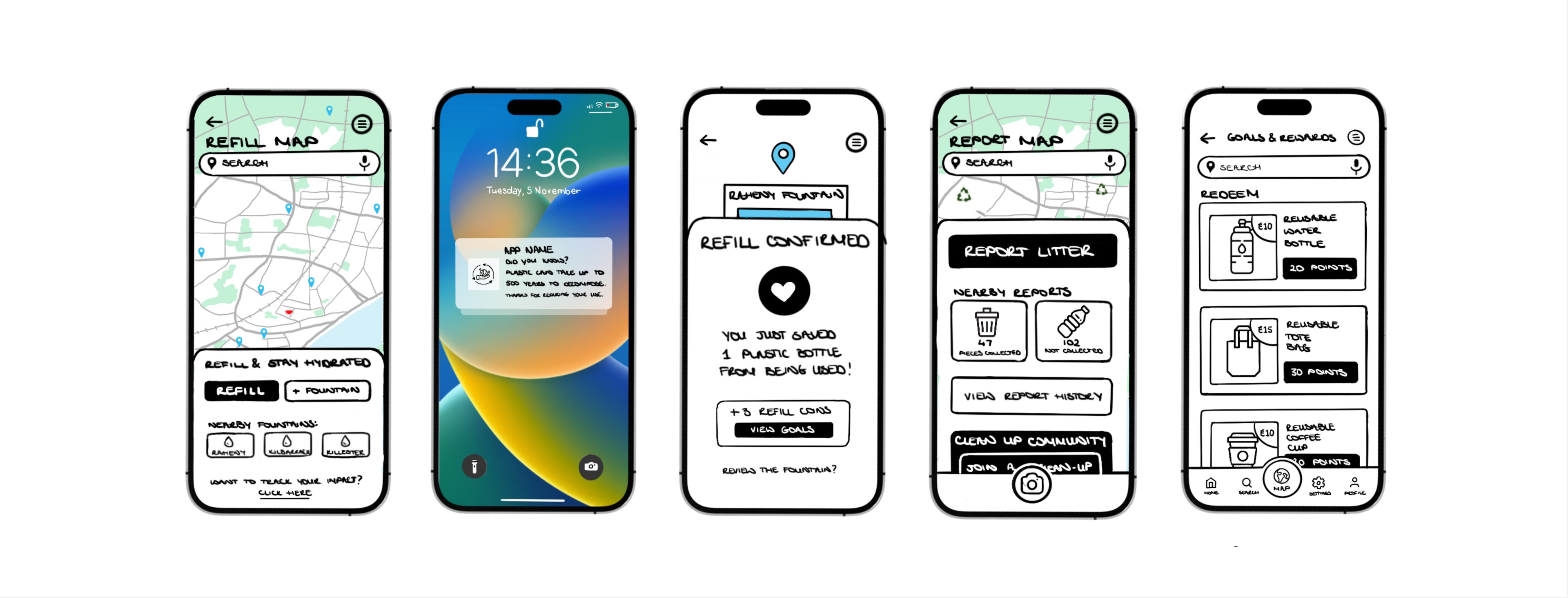
We built our feature set around three core functions: Reporting litter, Refilling water bottles, and Learning about sustainable habits. I focused on designing the Reporting and Refilling flows, while other teammates tackled the Learning section.
To support behaviour change, we introduced a points system where users would earn rewards for taking positive actions like reporting litter or refilling bottles. This decision was grounded in user behaviour research: according to the Nielsen Norman Group, positive reinforcement through small, meaningful rewards can build habit loops that drive repeat engagement. Additionally, the UX Collective highlights that reward systems are particularly effective when tied to a sense of personal impact and purpose, which our app aimed to deliver through its environmental mission.
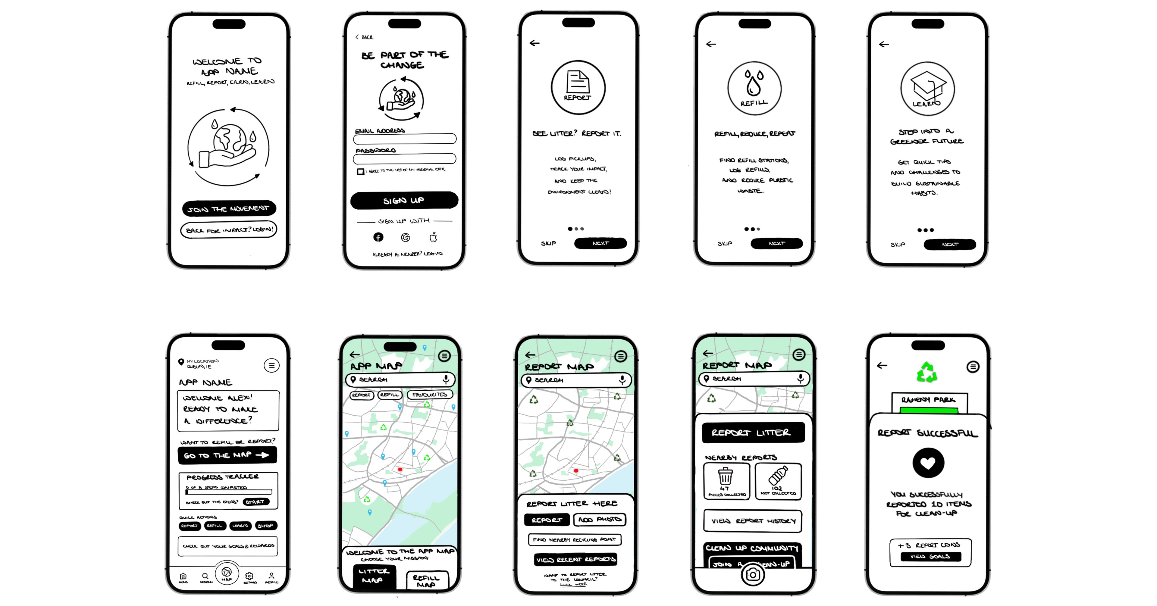
Designing Through Paper Prototypes
I began prototyping with paper wireframes, testing early concepts with users before digitising flows in Figma. After feedback from the first round of usability testing, I iterated the design - adjusting navigation, visual hierarchy and button clarity based on what users found confusing.
For example, users commented that the original reporting process felt a little long, so I simplified the report form to reduce unnecessary steps. This was based on research around cognitive load, which shows that streamlining tasks reduces mental effort and prevents users from dropping off mid-process (Sweller, 1988). The Learn tab was also refined with bite-sized content and challenge-based tasks to reduce overwhelm and maintain engagement, aligning with usability studies that suggest microlearning enhances user retention and motivation.
The second iteration of the prototype included clearer map views for refill stations, which were previously difficult to distinguish. I used clear iconography and subtle colour coding to help users differentiate locations more easily, inspired by visual hierarchy principles from the Material Design Guidelines.
This iterative loop between testing and refining helped me shift focus away from over-polishing visuals and toward making sure the features actually worked and felt intuitive to users. Each decision tied back to specific user feedback and recognised usability patterns.
What I Learned
Looking back, one of the biggest lessons was realising how easy it is to get caught up in UI polish too early. In the first round of prototyping, I focused a bit too much on graphic details rather than functional flow. With feedback and time, I was able to re-centre around purpose: making sure each feature served a clear user need.
If we had more time, I would’ve loved to expand the prototype to bring all team members’ sections together into a full, seamless app experience. Even so, the process reinforced how important research, empathy and testing are in building digital tools that not only work - but genuinely help people take action.
This wasn’t just about designing a nice interface. It was about using design to make environmental action easier, clearer and more rewarding for real users. And that, for me, is what good UX is all about.
Curious to see the full design?
Explore the full design in Miro and see how each decision comes to life.
Interested in seeing the full research process? Get in touch!
- Choosing a selection results in a full page refresh.
- Opens in a new window.